Meetlog
Description
Retrieve key insights buried in your meetings.
Duration
10 weeks.
Role
UI/UX Designer.
UX Researcher.
Tools
Figma.
Project Overview
As a result of the pandemic, employees now spend more time in online meetings than ever before in order to make decisions, review key objectives, and plan next steps. However, it is easy for information to get lost as they are buried deep within meetings, and are difficult to recover when needed most. It doesn't help that many meetings are redundant, long, and ineffective due to how poorly they are transcribed, organized, and archived. As a part of my capstone project for my UX design course, I was keen to research the problem space and discover possible solutions to help pull valuable insights when it’s needed most.
Solution
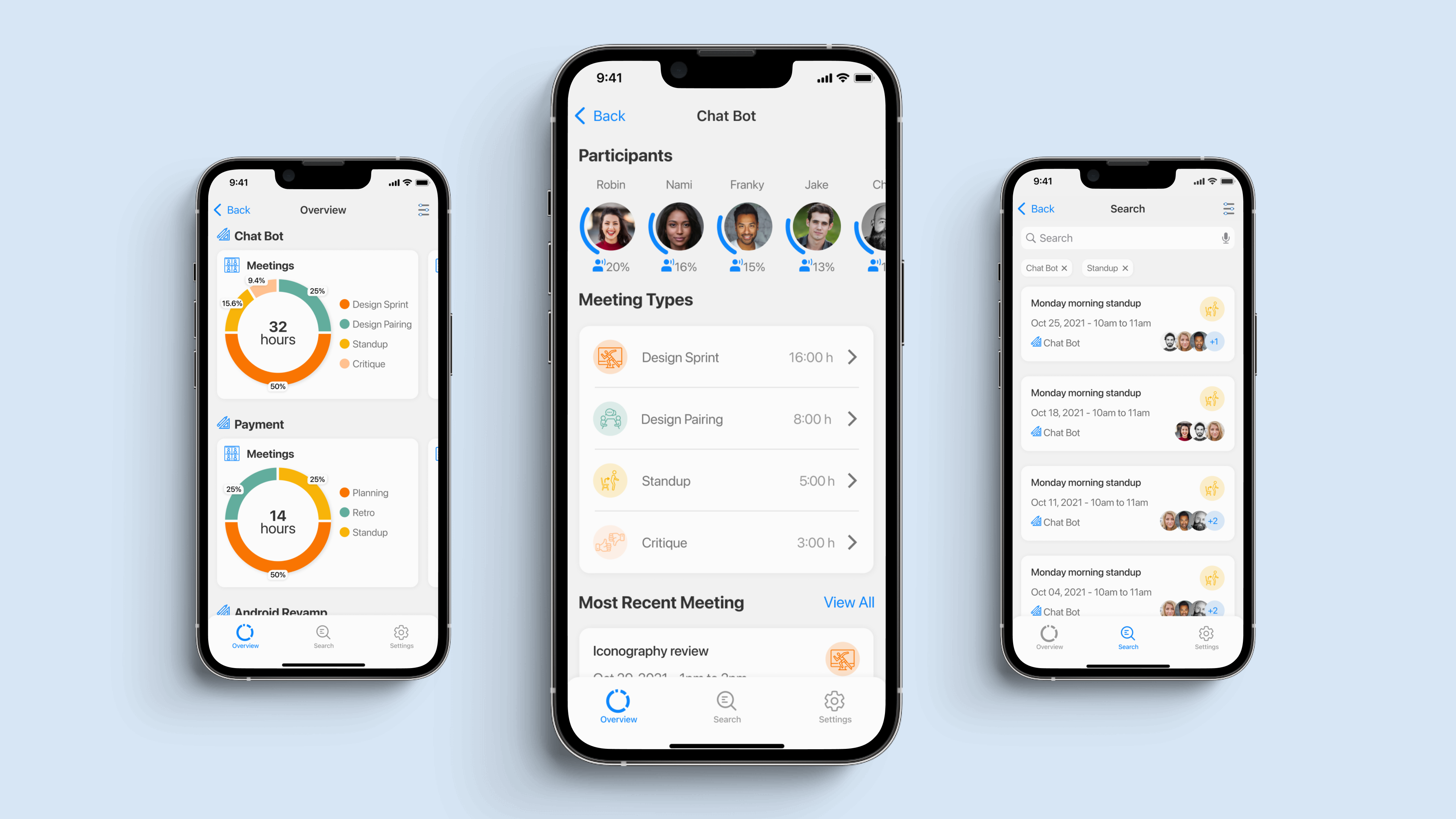
A mobile application which helps employees log, view, share and gain insights of all past virtual meetings.
 View Prototype
Process Overview
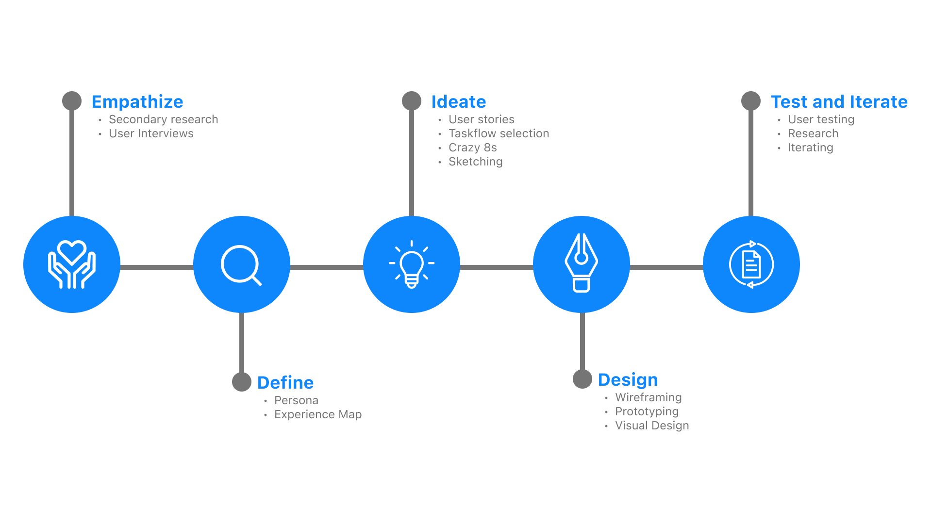
I followed the design thinking process to ensure that each element of my final product's design was rooted in research. I wanted all aspects of my design to trace back to the pain points, motivations, and behaviours of my user that were identified in my research.
Secondary Research
Objectives
- Learn: Learn about tech employees' pain points, motivations and behaviours before, during and after company meetings.
- Empathize: Have a better understanding of the perspective and experiences tech employees have in regard to online meetings.
- Gain Insights: Reveal insights into tech employees needs and requirements for meetings to be more time effective.
Research
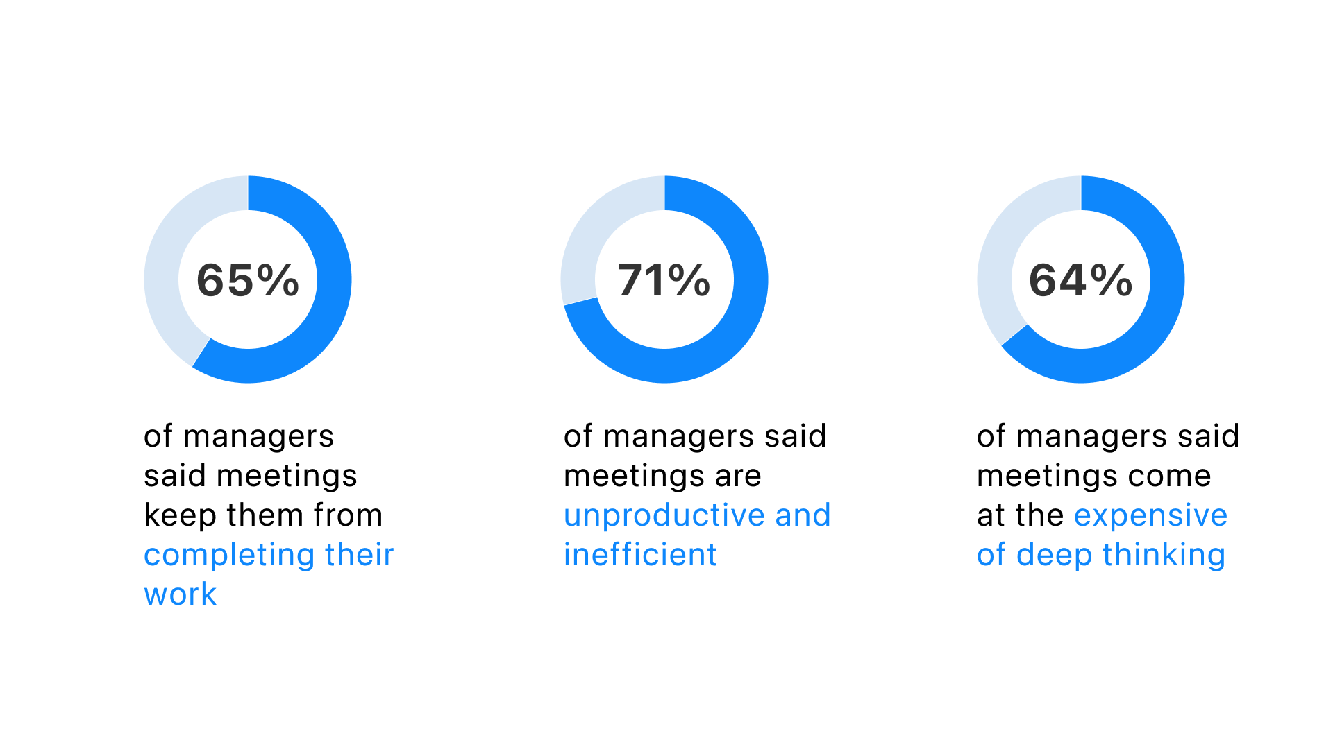
The University of North Carolina surveyed 182 senior managers and found the following results.
User Interviews
I conducted structured user interviews with 3 of my contacts that work within the tech industry in regard to their experience participating in virtual meetings at their workplace. User interviews are necessary in order to qualify data and improve my understanding of real life experiences within virtual tech meetings.

Defining the problem
Using the results of the user interviews, I organized the users goals, motivations and pain points into various themes to extract insights.
I identified common patterns of thought & behavior that users experience during virtual meetings to determine the key goals and frustrations. During this process, I continuously asked why to understand the underlying problems of these frustrations. To further define the problem space I grouped the most relevant insights and selected a specific theme to focus on.
- Meeting details are forgotten: Oftentimes details discussed during meetings are forgotten about and are reiterated in future meetings.
- Unable to track meeting results: There is a lack of results from meetings that are being held, they are not being tracked.
- No clear agenda for meetings: Agendas are usually not set or communicated before meetings.
- Meetings running longer than necessary: Meetings tend to last longer than needed due to poor time management.
- Participating in nonessential meetings: Employees found that they are often pulled into non-essential meetings.
Persona
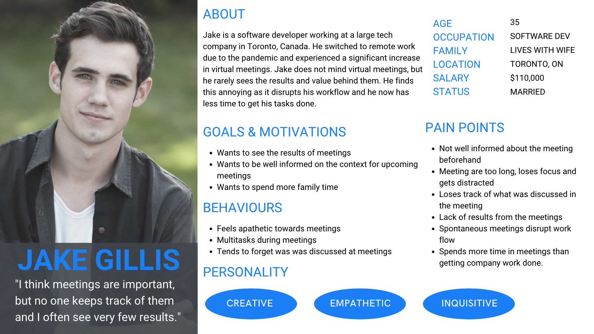
A persona was made in order to focus on the needs and give a clear picture of the user's expectations and how they're likely to use the application. It help to portray a better depiction of real people with backgrounds, goals, and values.
Task Selection
User Stories & Core Epic
Based on the goals of my persona Jake, I then created a set of 30 user stories under 4 distinct epics in order to help guide the functionality of my product. Ultimately, I chose to focus my efforts on the Gain insights as the primary epic and tracking past meetings as a secondary epic as it directly addressed my HMW statement.
Selected Task Flow
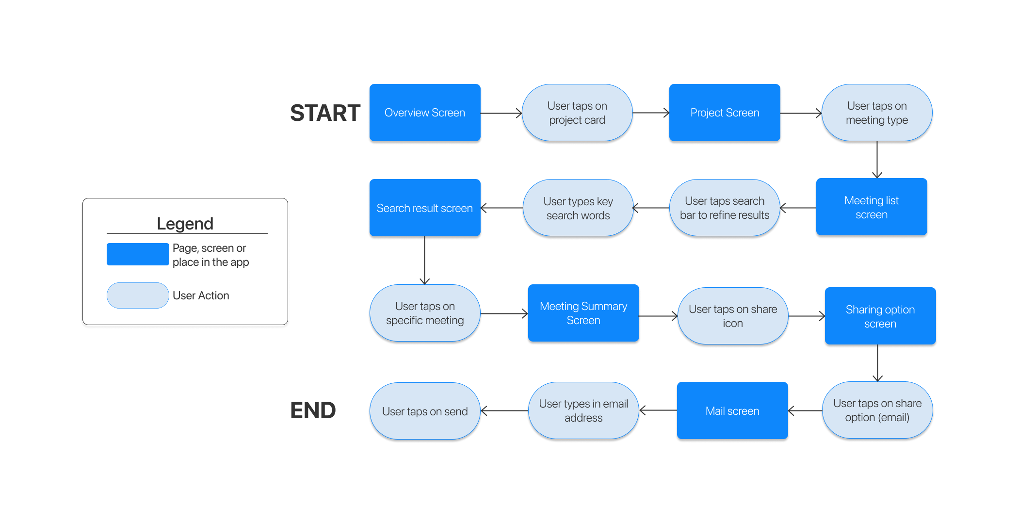
View insights and details of past meetings and share specific meeting details with coworkers.
The selected user story being able to track past meetings and the epic being to gain insights, I believed this was a great task flow to approach. With users being able to share past meeting details, insights and transcripts easily with colleagues they can onboard new members or update others with extreme ease.
Ideation
In the ideation stage, I utilized the crazy 8s technique to brainstorm a list of possible design solutions.
Design Solution & Features
- Automatically log transcripts of meetings.
- Auto generate tasks and decisions made during meetings.
- View how much time is being spent in specific meetings.
- Easily search and share details of meetings.
Solution Sketches
To flesh out my ideas more, I created more detailed sketches showing the various screens user flows.
Mid Fidelity Prototype
I then transformed my solution sketches into digital mid fidelity wireframes using figma. Utilizing the prototype interactions and animations within figma, I built a realistic prototype for user testing.

User Testing
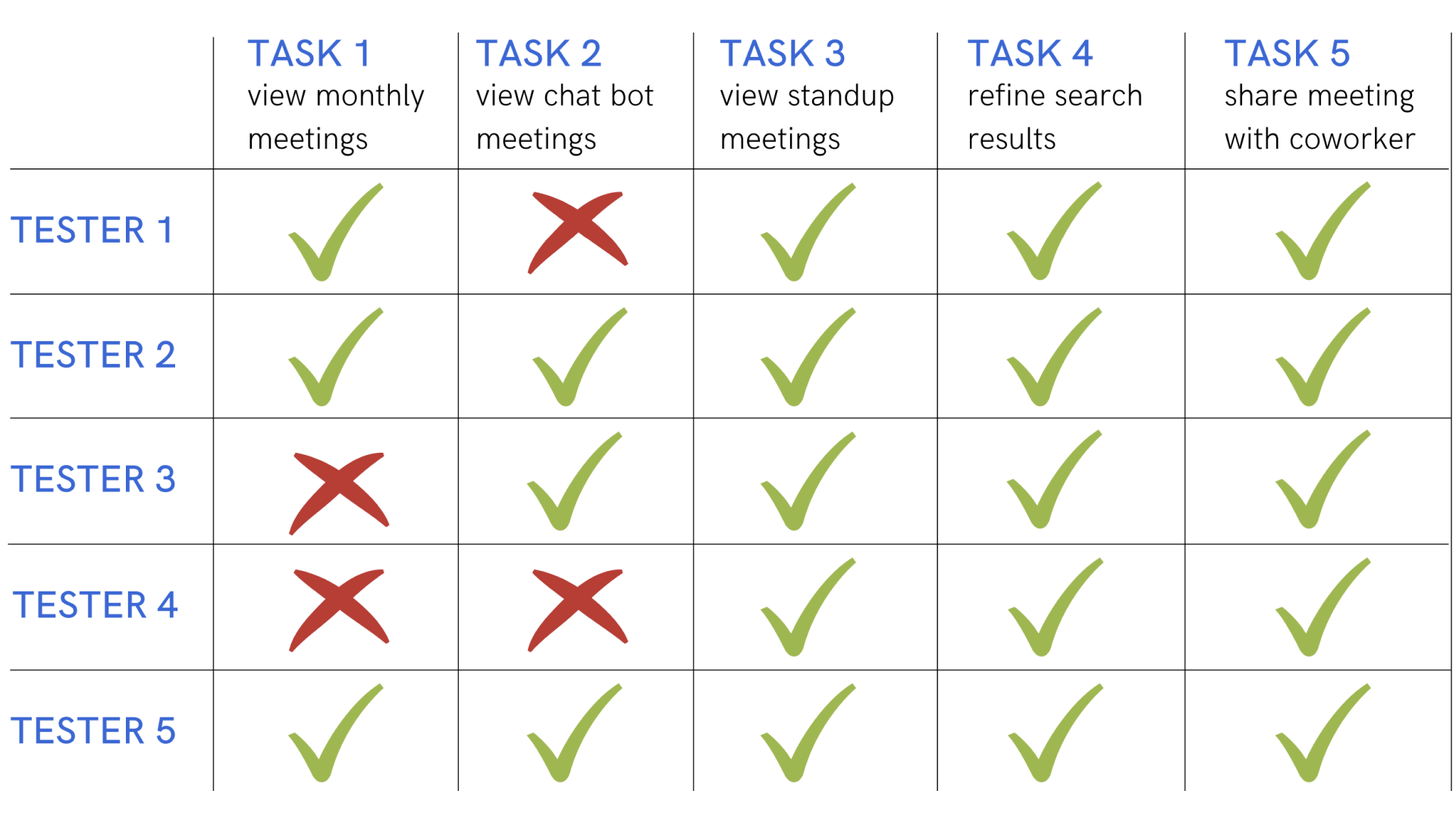
To test the usability of my product, I planned to conduct a series of remote usability tests. I conducted 2 rounds of usability tests with 5 participants each round in order to gain real-time feedback using my medium-fidelity prototype.
User Scenario
“ For this session I am going to ask you to imagine you are working remotely for a large tech company. A new member has joined your team and is looking to get updated on the chatbot project. Using our app you are looking to share a specific standup meeting with project chatbot. Your end goal is to share this specific meeting with your coworker through email. ”
Round 1 Testing
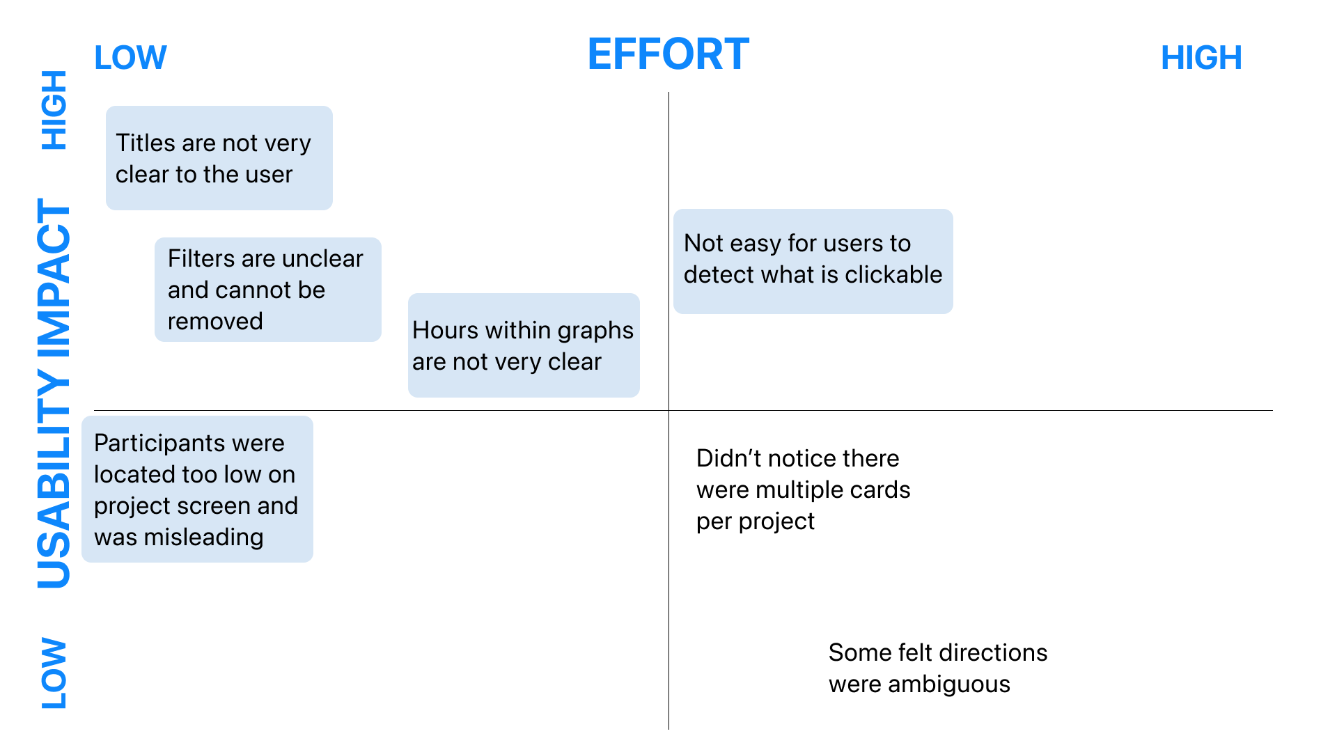
After synthesizing the user testing results and collecting all observations, I mapped out all usability issues and areas of improvement on a Prioritization Matrix in order to identify the severity of the issues. I will further improve the design based on these findings.
Results - Round 1
Matrix - Round 1
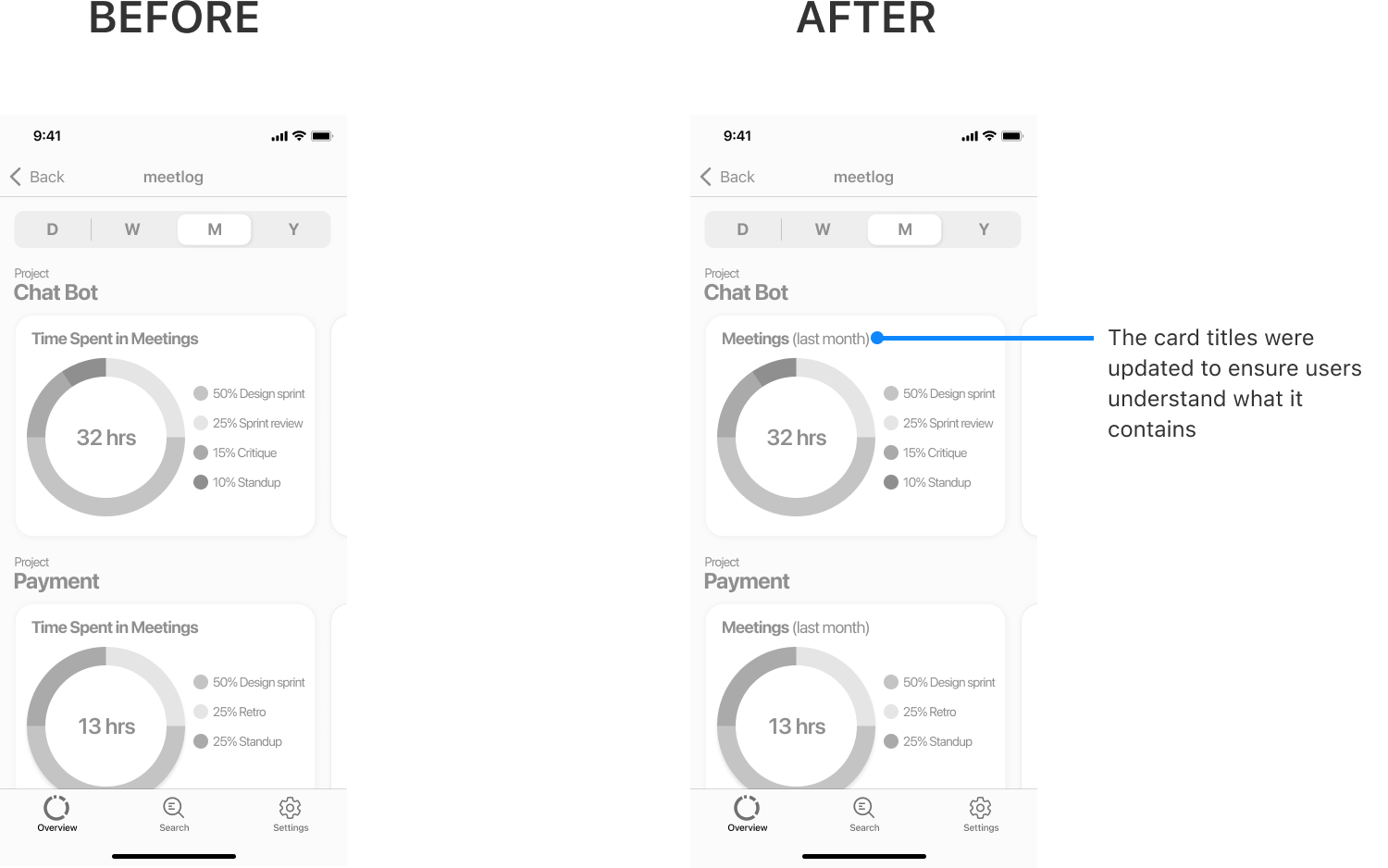
Update #1 - Clear titles
Update #2 - Hierarchy rearrangement
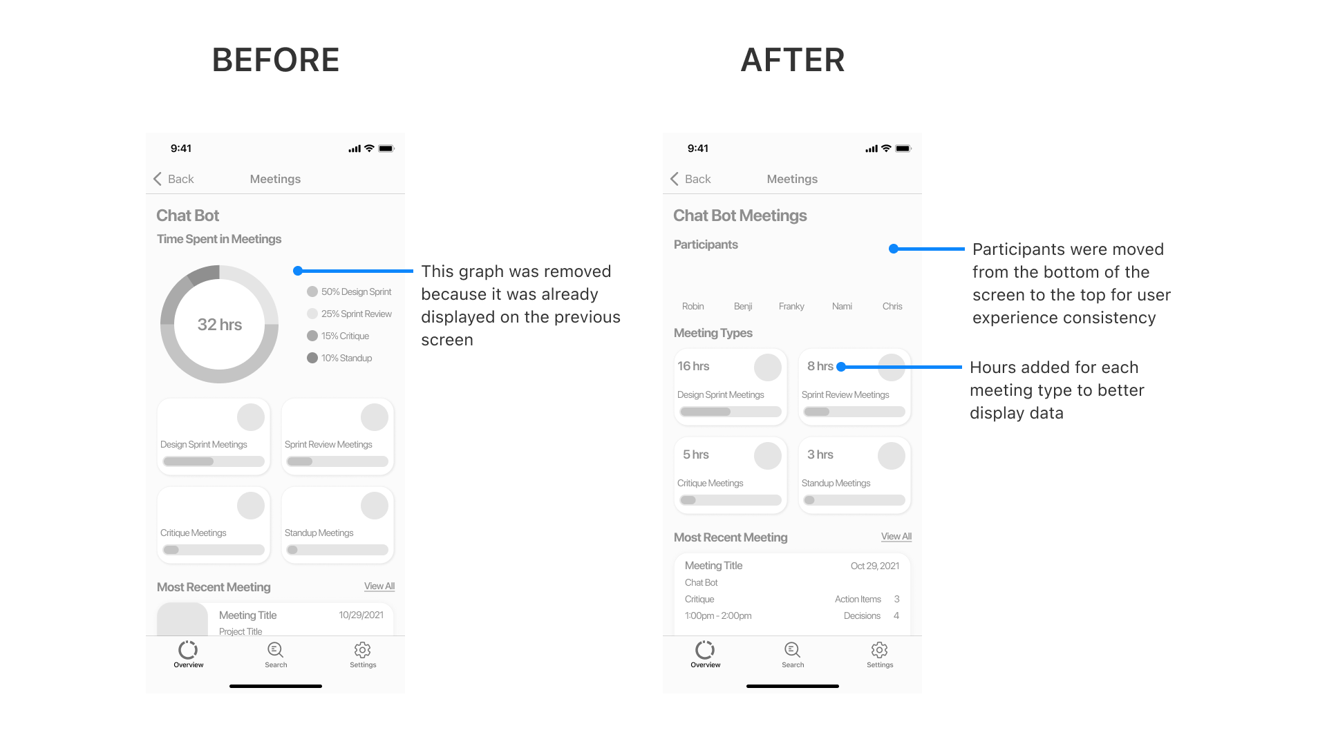
Update #3 - Filter and card update
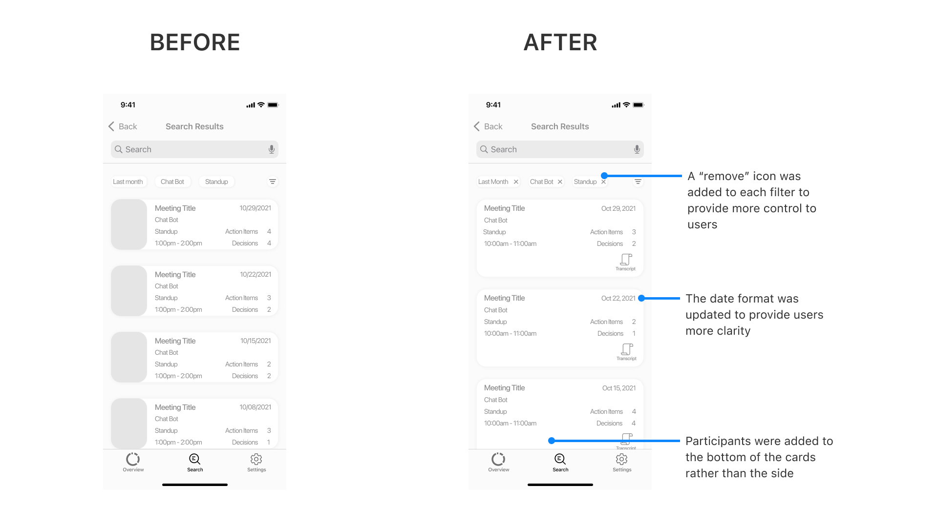
Round 2 Testing
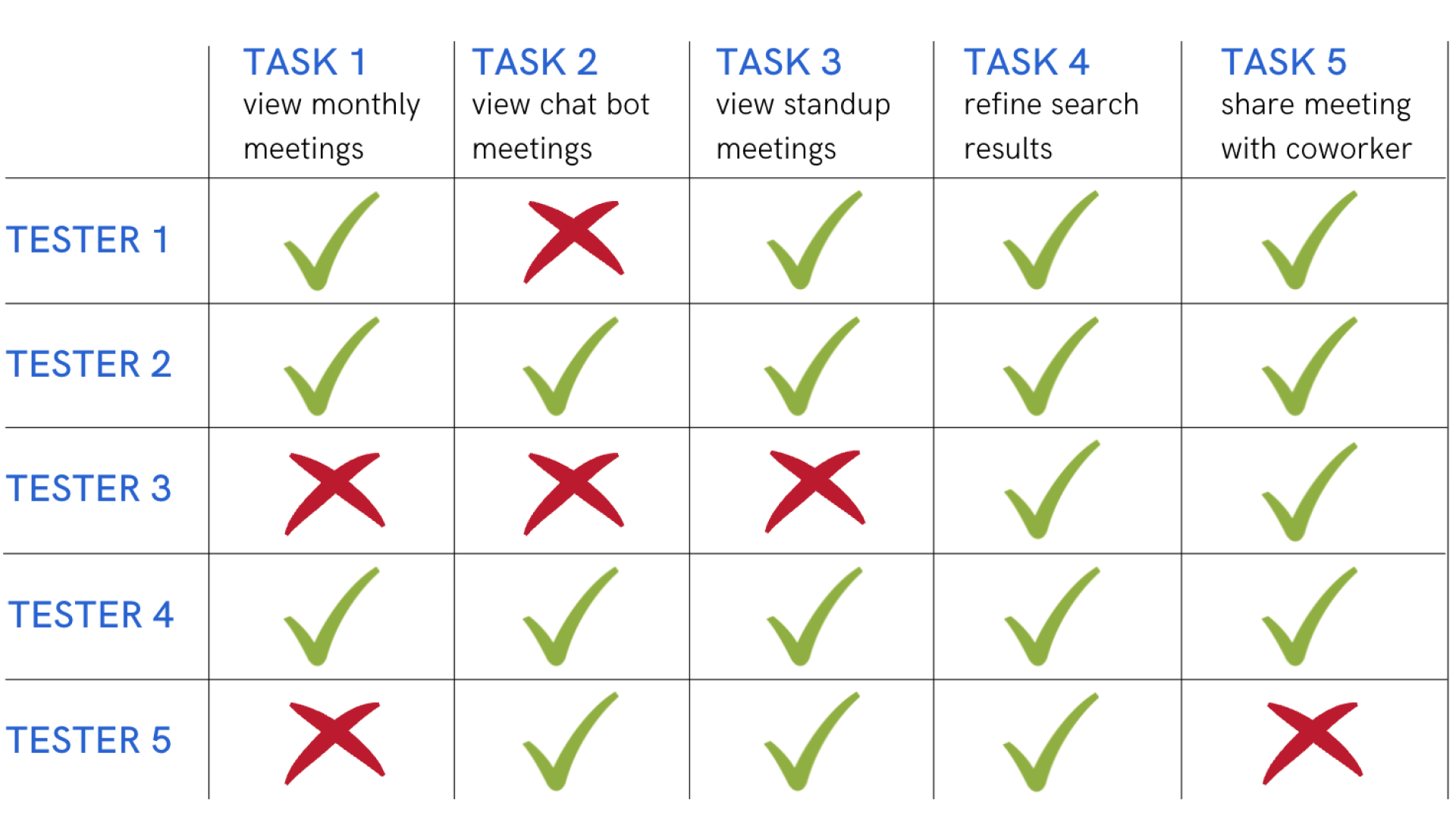
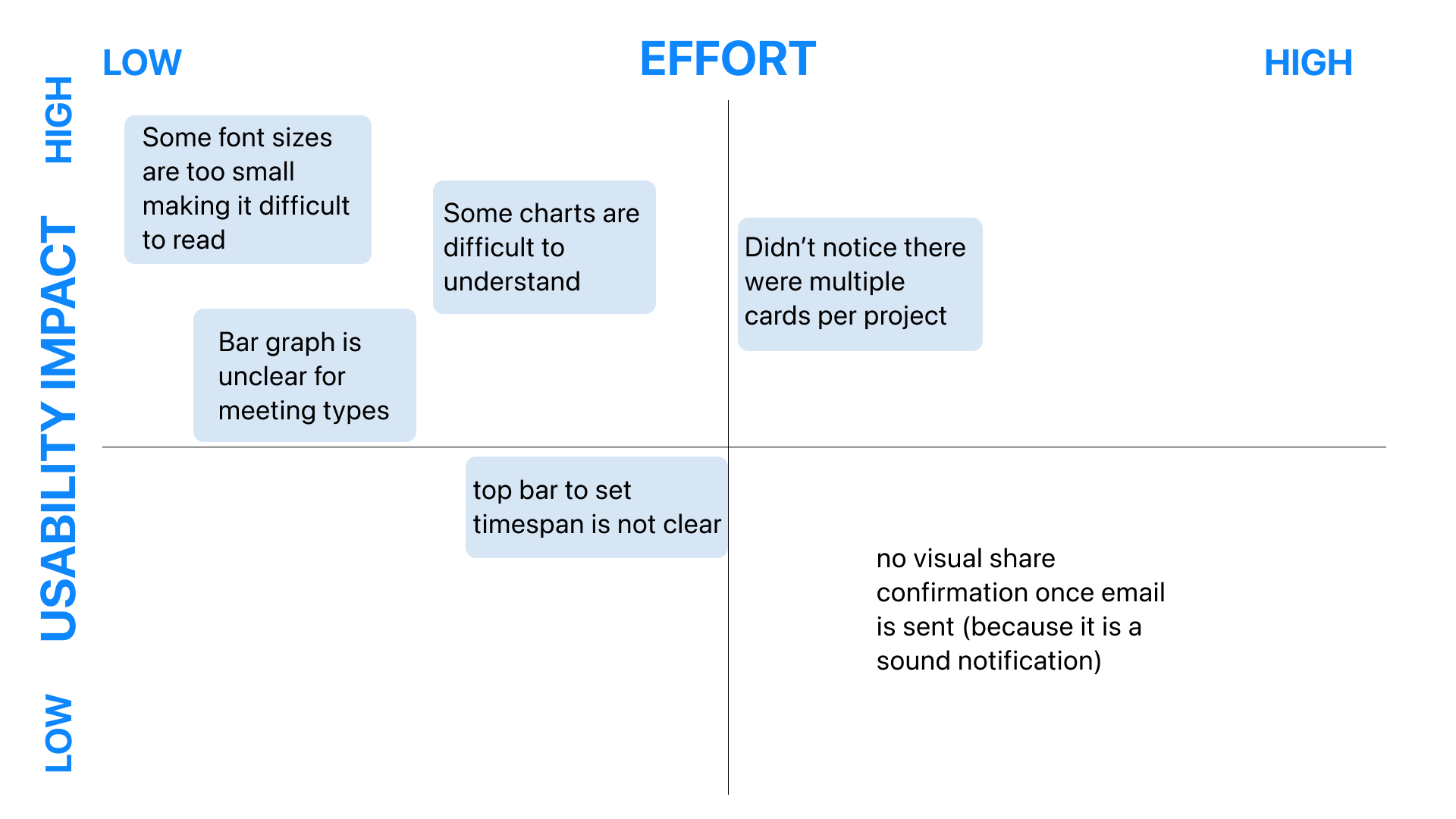
After synthesizing the user testing results and collecting all observations, I mapped out all usability issues and areas of improvement on a Prioritization Matrix in order to identify the severity of the issues. I will further improve the design based on these findings.
Results - Round 2
Matrix - Round 2
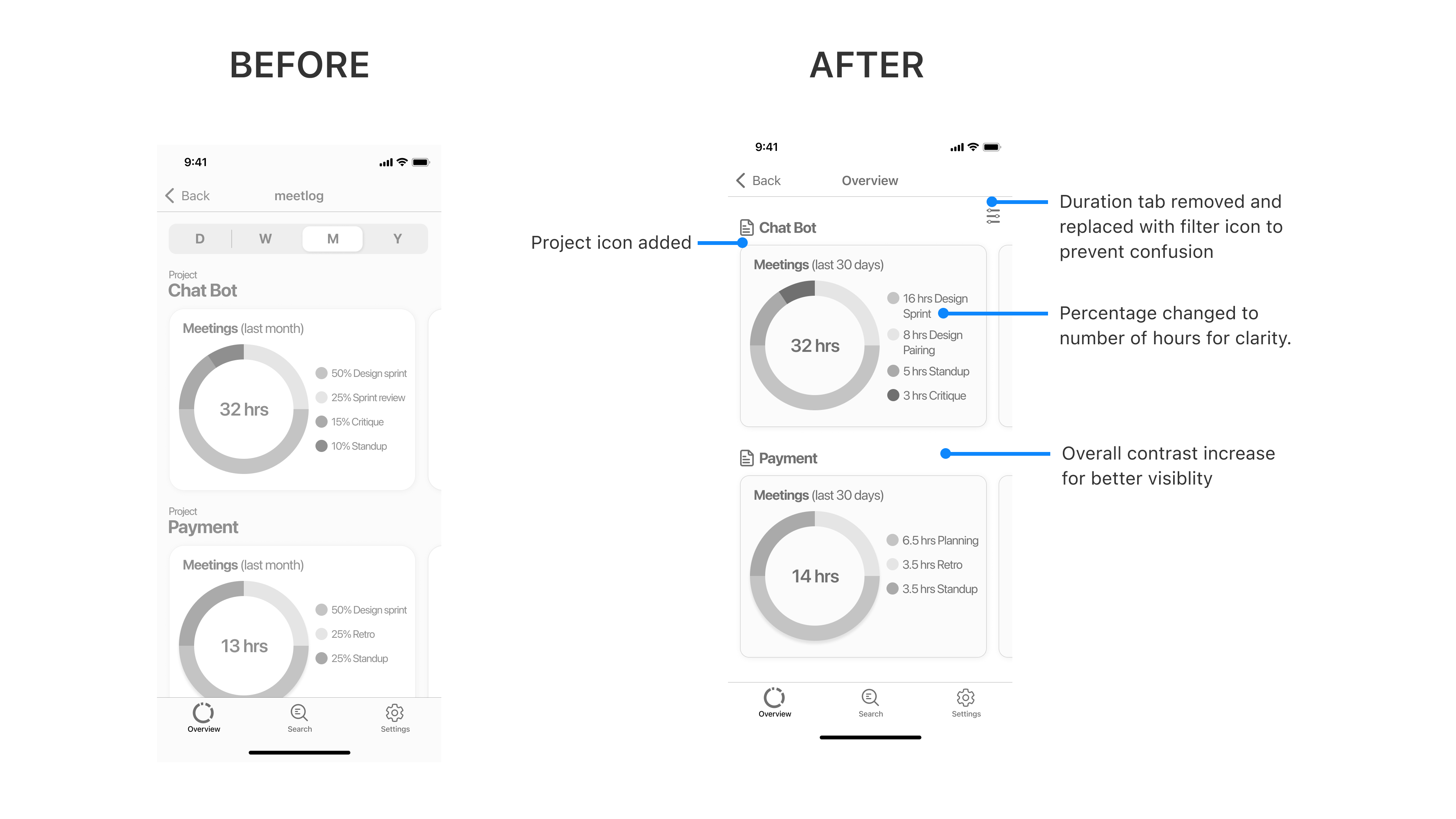
Update #1 - Increase contrast and clarity
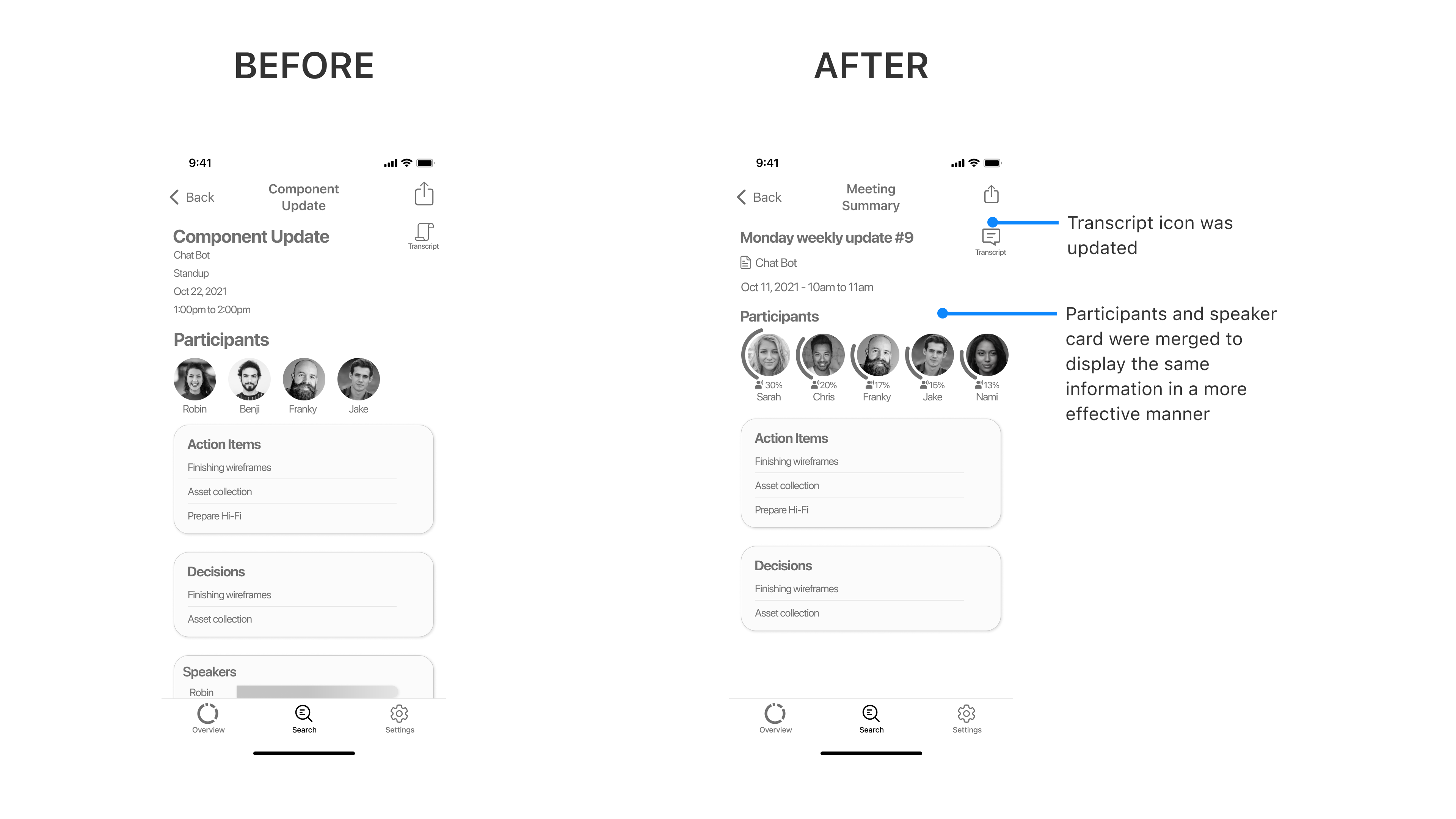
Update #2 - Meeting type update

Update #3 - Meeting context update
Visual Design
Setting the mood
I began the process of creating my brand’s visual identity by tying it back to my user interviews and identifying recurring keywords that met the needs of my users. I listed out 10 words that were relevant to the “feel” of the application that I wanted users to experience.
- Clean
- Technology
- Calmness
- Driven
- Organized
- Minimal
- Connect
- Helpful
- Modern
- Cooperative
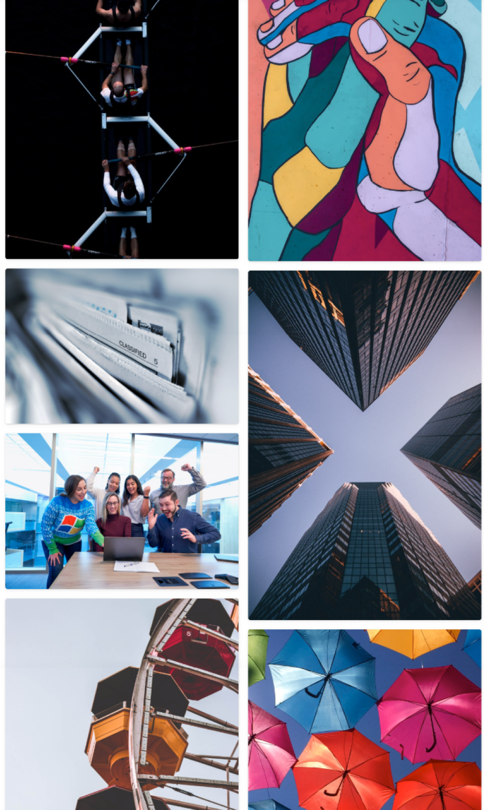
Inspired by these keywords, I created a visual identity mood board.
Colour Palette
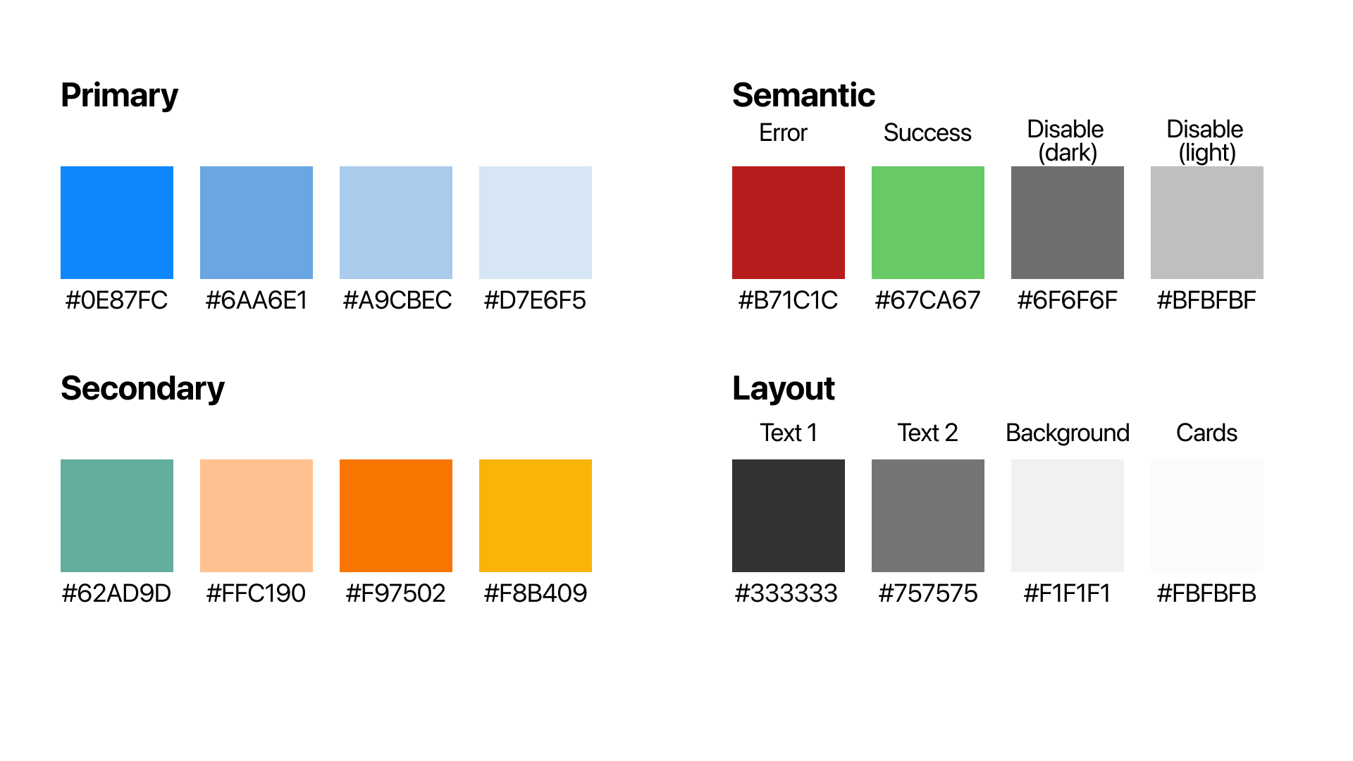
Drawing inspiration from the moodboard I created a style guide for myself to maintain consistency while designing the high-fidelity wireframes. The playful colors were chosen to influence feelings such as curiosity, calmness & motivation.
Typography
SF Pro Display was the primary typeface used for meetlog. It is used for both the headers and the body text within the mobile application. I decided to go with this typeface because I wanted the application to be native to iOS. It also has an elegant, clean look to it which complimented the overall mood board. I wanted clean typography that wouldn't distract users when performing tasks.

Wordmark
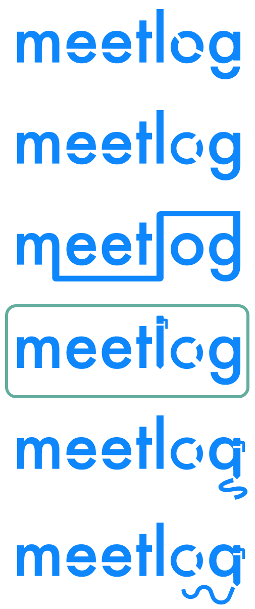
I researched and looked at many typefaces for the logo. After going through several fonts I decided that futura was the best fitting font for the design that I was going for. It has a clean and minimal aesthetic and brought a subtle nuance of technology. I then manipulated the font to add more character, drawing inspiration from technology logos like logitech. I found drastic changes looked unappealing so I selected a logo that was both simple but noticeable.
Application icon
Since Meetlog is meant to bring people together and cooperate in a more effective manner, I wanted the application icon to reflect this. I had initially thought of playing with the words "meet" and "log" but because each design became over complex I wanted to simplify this. I ended up with the result below which shows people coming together over the letter "m".
High Fidelity Design
Colour Injection
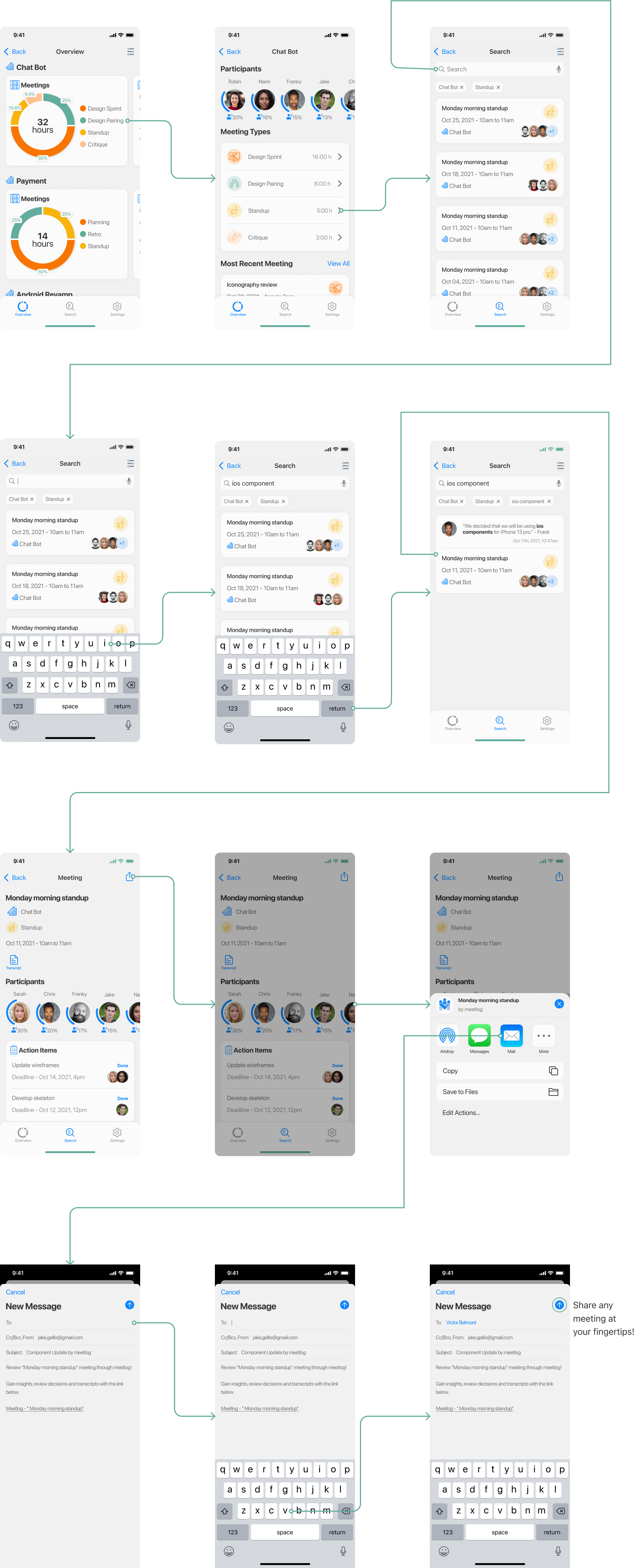
With the visual identity of my brand sufficiently developed, I began applying colour, imagery, and branding elements into my wireframes and refined my prototype. After multiple colour injection tests and iterations, I arrived at my final design.
 View Prototype
What's next for Meetlog
Meetlog is a step in the right direction towards unlocking the full potential of online meetings and improving the remote work experience. For immediate development, working on ways to track additional metrics and pull more insightful details from meetings would be the next step. I would also like to look into the accessibility functions of the application so that meetlog can be even more interactive and used by everyone. There is much more potential for the application that can be worked on during development. All updates would be validated first through research and testing.
Long term, I would like to bring meetlog to the international audience. With more people working remotely it is very common to speak to people across the globe. Adding additional language and being able to translate on top of transcribing would be the next step that would evolve the application entirely.
Key Learnings
- Design is a non-linear process: Throughout the process, I found myself conducting research along the way both formally & informally. I uncovered new findings & continuously iterated on my medium & high-fidelity prototype. Had I stuck to a strict process, I would not have made all the improvements I did.
- Draw inspiration and learn from others: Initially I was trying to create something completely new, but I found that utilizing colours and design patterns from professional designers would be a much better choice than my designs.
- Users inform the design: After weeks of intensive research, it is easy to assume you have all the answers. Yet, the design elements I'm most proud of were inspired directly from my users. By asking the right questions, and constantly iterating and testing my designs, I was able to reach a solution I would have never otherwise conceived. User feedback was the basis of my design rationale.
